Breaking the Mold: A Unique Identity For Critical Path Imaging
Scope of Work: Brand Identity. Logo Design..
Critical Path Imaging is a clinical trial analysis consultancy that provides consulting and advisory services for pharmaceutical companies. We were tasked with developing a unique brand identity for the new company that accurately represented its services and set it apart from the competition.
The Challenge
Our primary challenge was creating a visual identity that effectively communicated the company’s services while avoiding the cliches commonly associated with the industry. Additionally, we needed to design an identity that didn’t make it look like an MRI or radiology center, as may be assumed by the name itself.
Click To Read More
Our Ah-ha! Moment
To overcome these challenges, we developed a creative solution that involved graphically representing the charts and graphs seen in the test results of pharmaceutical trials. This allowed us to capture the essence of the company’s work without relying on visual cliches.
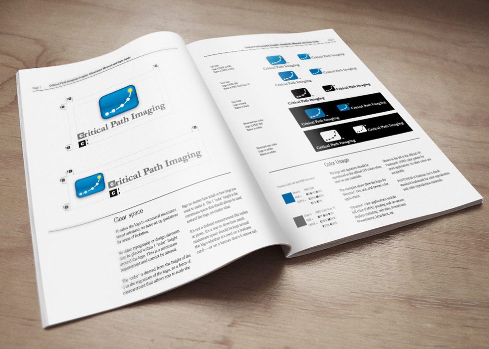
The centerpiece of our branding solution was the creation of a dynamic logo that effectively communicated the company’s services while avoiding any visual association with MRI or radiology centers. We also developed a set of graphic standards to guide the use of color, typography, and imagery to ensure consistency across all brand applications.
Meeting the Client’s Objective
Our efforts in developing a unique brand identity for Critical Path Imaging resulted in a successful solution that captured the essence of the company’s services while avoiding the cliches of the industry. The client was thrilled with the result, and the branding continues to help the company stand out in a highly competitive market. This unique challenge required us to think creatively and accurately represent the company’s services through visual identity.

Primary Logo

Alternate Logo

2-Color logos and Mono Marks
Graphics Standards Guide

Business Card Design

Other Case Studies You Might Be Interested In
Knox Promos
Brand launch for Knox Promos, a new corporate promotional products offshoot of an established screen-printer.
Queen Creek Chamber Of Commerce
New visual identity program creates consistency across all Queen Creek Chamber of Commerce communications, events, and programs.
TransCity Properties
Logo refresh captures the essence of business while maintaining elements of its original identity.
Community Choice Pediatrics
From confusion to clarity: Unifying multiple pediatric practices into a single brand
COPA Health
Merging for a Greater Cause: The Challenge of Creating a New Brand Name.
Cyclone Shipping
Reinventing a brand and re-energizing its founder.


