Knox Promos
A Seamless Brand Transition for Knox Promos
Scope of Work: Brand Positioning, Brand Identity. Logo Design. Website Design. Communications Strategy.
We worked with Knox Promos, a new offshoot company of Surf & Ski screen printing, to create a unique brand for their specialty corporate promotional products. The client’s objective was establishing a brand that would stand out in a crowded corporate gifts and promotions marketplace.
PROJECT DETAILS
Brand Positioning Strategy and Visual Branding Elements
To begin, we developed a brand positioning strategy for Knox. This involved thoroughly researching their target audience, industry trends, and the brand’s unique selling points.
Click To Read More
Once the brand positioning was established, we created the visual branding elements. A distinctive logo was designed that reflected the brand’s personality and values, along with graphic standards that ensured consistency across all marketing collateral.
Marketing Collateral And Brand Transition Communications Strategy
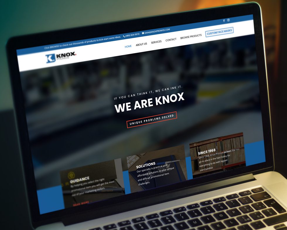
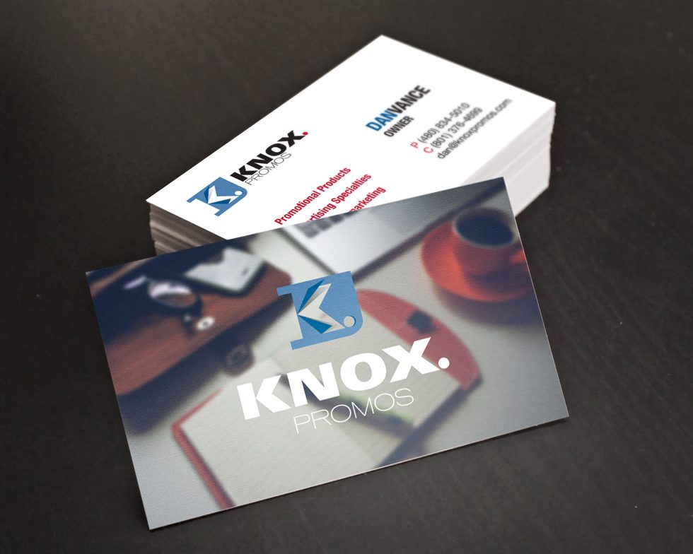
To showcase Knox Promos’ products and services, we designed a modern and user-friendly website that provided a seamless browsing experience for customers. Visually appealing business cards and email marketing campaigns were also created to help the brand connect with its target audience personas.
Finally, we developed a comprehensive brand transition communications strategy to ensure a smooth transition from Surf & Ski screen printing to Knox Promos. This included creating a clear messaging plan and communicating with existing clients to introduce the new brand.
Meeting the Client’s Objective
Overall, the client was thrilled with the results of the project. We delivered a unique and compelling brand for Knox Promos that sets them apart from their competitors and positions them for success.
Primary Logo
Alternate Logo
2-Color logos and Mono Marks
Other Case Studies You Might Be Interested In
Critical Path Imaging
Critical Path Imaging gets a unique new identity program.
Queen Creek Chamber Of Commerce
New visual identity program creates consistency across all Queen Creek Chamber of Commerce communications, events, and programs.
TransCity Properties
Logo refresh captures the essence of business while maintaining elements of its original identity.
Community Choice Pediatrics
From confusion to clarity: Unifying multiple pediatric practices into a single brand
COPA Health
Merging for a Greater Cause: The Challenge of Creating a New Brand Name.
Cyclone Shipping
Reinventing a brand and re-energizing its founder.
