COMMUNITY CHOICE PEDIATRICS
From confusion to clarity and continuing our partnership: Unifying three pediatric practices into a single brand
Scope of Work: Brand Positioning. Brand Identity. Name Development. Domain Name Research. Trademark Research. Marketing Strategy. Website Design.
The Situation
Three established pediatric practices — Lee’s Summit Group Pediatrics, Raintree Pediatrics, and Blue Springs Pediatrics — had long worked together under one umbrella but maintained separate names, logos, and color schemes.
When Children’s Mercy Hospital in Kansas City invited them to become an affiliate, the opportunity was exciting — but the brand confusion was a problem. Another local practice, Summit Pediatrics, was already affiliated with the hospital, and even used a domain name (leessummitpediatrician.com) that was nearly identical to one of the group’s offices.
The result: patients and referring physicians struggled to tell one practice from another. The website, which combined three pediatric brands and one adult internal medicine practice, added even more confusion.
The challenge was clear: create one unified pediatric brand that would simplify the story, strengthen the hospital affiliation, and make the group’s reputation unmistakable across the Kansas City metro area.
Our Solution
Brenits Creative led the group through a complete brand positioning and naming process to separate the internal medicine division and unify the pediatric practices under one strong identity.
We began with discovery sessions to clarify shared values and patient promises, uncovering a common thread: community connection and collaborative care. From there, we curated multiple rounds of name options, focusing on ideas that conveyed trust, togetherness, and local pride.
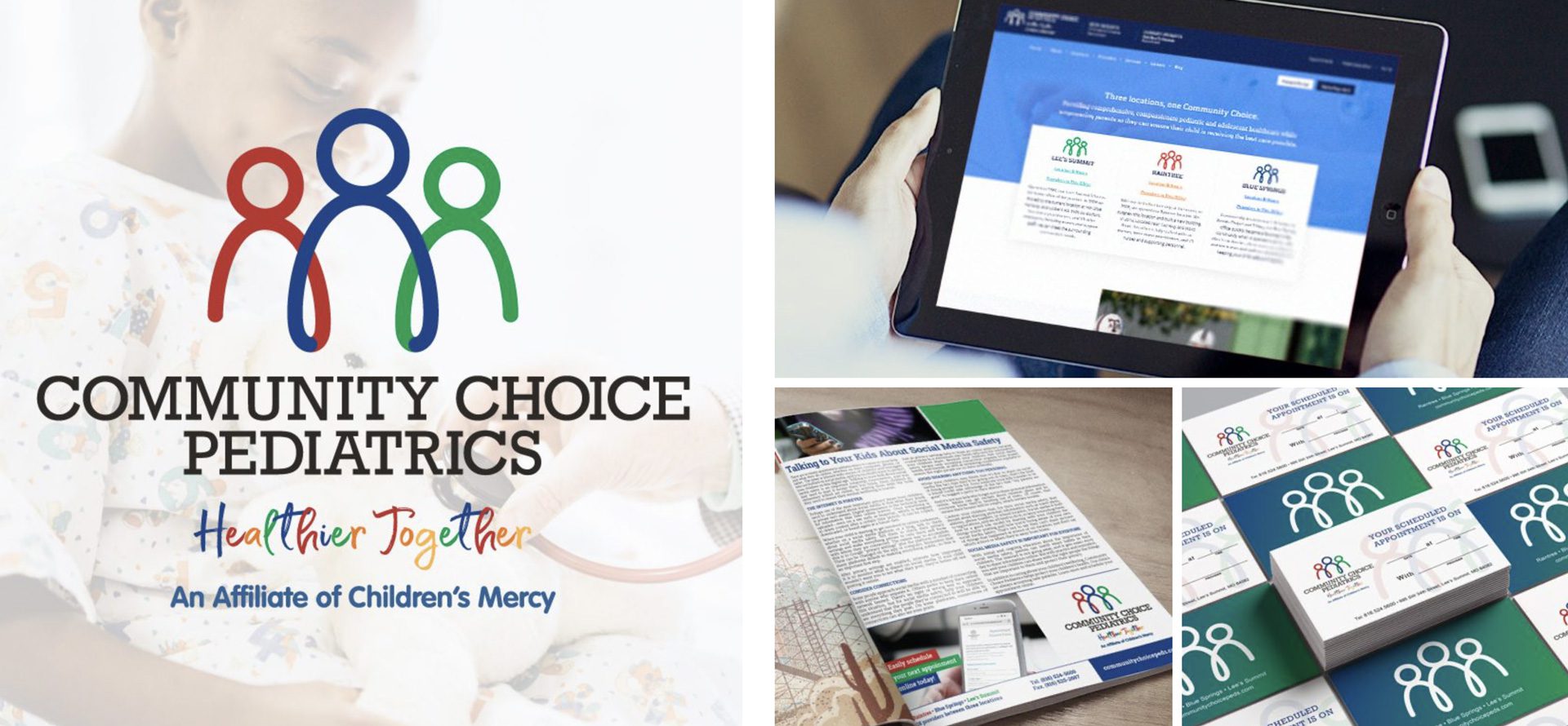
The winning name — Community Choice Pediatrics — captured everything the group stood for:
- “Community” reflects their local roots and neighborhood care.
- “Choice” reinforces their reputation as a trusted, preferred provider.
- “Pediatrics” clearly communicates their specialty and focus.
We paired the new name with the tagline “Healthier Together.”
Then we built a fresh visual identity system, including logo, color palette, and typography, followed by a search-optimized website designed to clearly present locations, services, and provider bios.
The rebrand aligned perfectly with their new affiliation, positioning Community Choice Pediatrics as a leading regional pediatric practice.
The Outcomes & Results
The impact was immediate and measurable.
- 20% increase in revenue following the rebrand.
- Unified brand recognition across all offices and online platforms.
- Improved patient clarity — families now instantly recognize the practice and its connection to Children’s Mercy Hospital.
- Staff pride and engagement skyrocketed — everyone wanted new t-shirts with the updated logo.
Chief Operating Officer Chad Fletcher shared:
“Andy Brenits walked us through the rebranding process from start to finish. Seeing our new logo and website come to life made the entire process so meaningful — and before I knew it, everyone on staff was asking for t-shirts with our new name!”
Our collaboration with Community Choice Pediatrics continues today through ongoing brand and marketing strategy, including social media, community outreach, and advertising initiatives that keep the practice top-of-mind for Kansas City families.
More Work You Might Be Interested In
Critical Path Imaging
Critical Path Imaging gets a unique new identity program.
Knox Promos
Brand launch for Knox Promos, a new corporate promotional products offshoot of an established screen-printer.
Queen Creek Chamber Of Commerce
New visual identity program creates consistency across all Queen Creek Chamber of Commerce communications, events, and programs.


