A logo is a powerful visual representation of your company. It forms an impression that should be memorable, unique, and positive. An effective logo is the start of a successful corporate identity. Your company can be as up to date in its services and products as you like, but if your logo looks like 1983 your company’s image – and profits – will suffer. While you can’t completely control your corporate image, you can influence it to a large degree.
Every successful logo design project begins when senior management sees the logo not as a decoration, but rather as an important component of their brand. Before working with a professional to design your identity, it helps to know a little more about logos. Some might suit your business more than others.
What you should look for in an identity design
- Simplicity: Simplicity can make the difference between good and bad design, between a “look” that’s strongly memorable and one that’s instantly forgettable.
- Shapes: Our brains are hardwired to recognize smooth, closed, regular shapes. This tendency is especially strong under conditions of short exposure, competitive surroundings, or low attention level. If your “message” is too complicated, people simply won’t remember it.
- Memory and Recognition: Memory and recognition depend partly on the strength of the initial impact and partly on subsequent reinforcement. Simple designs can be made bolder than complicated ones and, therefore, make a stronger initial impact. There is less to remember about a simple design, so subsequent reinforcement is easier. In disorderly surroundings, simple design always stands out.
- Appropriateness: When looking at any design, consider the function of the item. Consider the following: What is its intended use? Where will it be used? How long will it be used?
Different kinds of logos
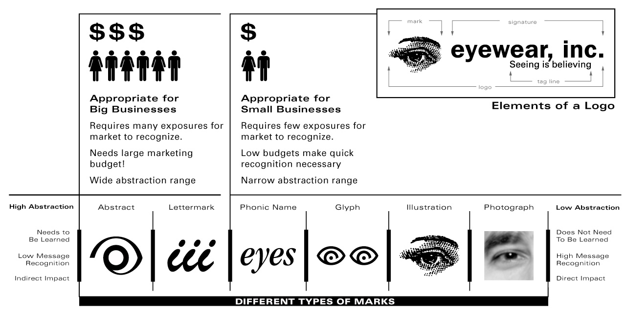
- Typographic Logo: Also known as a logotype, this logo consists of your name only, in an appropriate typeface. Typographic logos are the most common marks since they can be easily assembled and are the most straightforward way of defining a company. Usually, they are used as a starting point and can be adapted to incorporate graphic or symbolic elements within the typography. When a graphic or symbol is added, the typographic element becomes known as the signature. Examples: Coca-Cola, PriceWaterhouseCoopers, and Ford.
- Graphic Logo: This logo uses a graphic that clearly illustrates what your business does. Also known as a descriptive logo, it has a direct correlation between its visual message and its owner’s products or services. The mark can represent a product, demonstrate an area of expertise, or define the cause or mission of the organization. It can also be a graphic representation of the company’s initials. Examples: IBM, Apple Computer, GE, and Merrill Lynch.
- Symbol Logo: This logo uses an abstract symbol, or mark, to reflect your business. A symbolic logo will usually incorporate a figurative element into the overall design. These symbols facilitate an intangible or abstract element within the company or organization’s overall business or purpose. Examples: AT&T’s globe, Chase Bank’s Hexagon, and Nike’s Swoosh.
Elements of a logo
A logo is composed of the following graphic elements.
- Graphic or Symbolic Mark: A mark, or trademark, should have the qualities that are basic to its usage: individuality, memorability, and legibility. It must convey its message in quick and simple terms.
- Logotype or Signature: The corporate signature is the standard form of writing a name, with or without a symbol.
- Color: Although color alone is not enough to identify a corporation, it can be used effectively to support a graphic program.
- Tagline: Your tagline is the short phrase that summarizes what your company is about. It quickly and clearly explains your product or service. It’s a tiny but key piece of identity and brand recognizability. If it’s clever, it can enhance and add personality to your brand. If it’s clear, it tells someone what your company can do for them.
Selecting an effective mark
Too often designers make serious mistakes when developing marks for clients, particularly small businesses. A good checkpoint is to evaluate the company budget and determine the money available for marketing and promotion. If a budget is large, then a highly abstract mark is a possibility. More money buys more exposure to the mark, which translates directly into market recognition. When a budget is small, few exposures can be purchased, magnifying the need for quick recognition and low abstraction. A high level of abstraction is a luxury only companies with large marketing budgets can afford. Low abstraction marks are quicker, more effective visual tools.

The six universal attributes of a great mark
If we weren’t in the room when the decisions were made – if we don’t know what the CEO’s intentions were – how can we say one logo is “better” than another?
As in ice skating, technical merit can be judged independently of communications content, and we can all see the skater fall. The first five things that distinguish great marks from ordinary ones are technical; the last one addresses content. Great marks are always:
- Distinctive. The design idea doesn’t need to be the most unique in the world, just distinctive enough so you can “own” it in your particular marketplace.
- Practical. The design can be printed small, in ink or pixels; works in black on white as well as in colors; works in reverse too, white on black. (Faces, human or animal, usually flunk this last test; the eyes turn white.)
- Graphic. The design communicates purely in visual terms, to the right brain hemisphere; it doesn’t depend on verbal, intellectual interpretation. If it’s a wordmark, it can be recognized by form alone (you don’t have to “read” Coca-Cola’s logo more than once or twice).
- Simple in form. The design contains only one graphic idea, one gimmick, one dingbat. Thus if there’s a symbol, the accompanying name is plain and unadorned. And if it is a wordmark, one idea or device makes it special–like IBM’s stripes. (The more unique the name, the simpler the graphics can be.)
- One message. Great designs try to express no more than one attribute (such as stature or speed or dynamism) and support a single aspect of positioning.
- Appropriate. In the end, of course, the content’s got to be right. An otherwise-great mark fails if the reputation, positioning, and personality expressed are at odds with management intentions.
Your logo is not your brand.
Your logo sends a message about your company, and it represents your brand visually. “Branding” communicates four key properties of an organization: message, values, benefits, and relevant attributes. Design has an important role in communicating your brand’s message visually, but your logo can’t do it alone.
If you think bold, memorable branding is only available to big companies with massive marketing budgets, think again! No matter your industry, you can cultivate a unique brand that resonates with your clients. Want to know how to do it?
Small Business Branding Tips
Clarify Your Company’s Purpose
For a brand to be meaningful, it must connect to your company’s reason for being (which, incidentally, assumes you have a reason for being above and beyond simply earning an income.) Why did you start your company? How do you think you’re making the world a better place? Without a firm grasp of your purpose, you’ll never be able to communicate what’s unique and important about your company.
Enlist Your Employees
Along with clarifying your purpose, you must also ensure that every single member of your staff understands that purpose and knows how and why to communicate that purpose with every customer. In a perfect world, your purpose isn’t something that’s pounded into your staff. It’s something you hire for. When you hire an employee who shares your values, then you’re on the right track. Effective branding isn’t an afterthought. It infuses everything you do!
Create a Rallying Cry
So for my company, Profit First, our purpose, our rallying cry is “We want to eradicate entrepreneurial poverty!” We say it, and we mean it. Every morning huddle (our quickie standing meeting) reiterates our purpose and the steps we’re going to take that day to accomplish it. Our rallying cry lets us communicate our purpose and values quickly … to anyone and everyone. That’s our brand.
Enlist Your Customers
You know your purpose. Your staff knows your purpose. But do your customers know your purpose? Letting your clients know that they’re buying more than just your goods or services is key to enlisting them in your brand building efforts. Consider the Life is Good brand. When people don a t-shirt, they’re making a statement about a lifestyle, rather than just getting dressed. Folding in what makes you unique and worthwhile is a big part of successful branding.
Hire a Pro
Sometimes we think we should be able to do it all, but no matter how talented you are, you need help in the areas that aren’t your strength. If marketing isn’t your thing, consider hiring a consultant or agency to help you crystallize and evangelize your brand. Professionals can help you avoid spinning your wheels and wasting money on ineffective tactics.
Your brand is more than just your company name and a slogan. It’s the expression of your values, your quality, and your unique vision. Branding done right cements you in the minds of your customers. It makes it easy for people to understand who you are and what you do. Branding differentiates you from your competitors, and it speaks to your ideal customer, resonating with the people who will most appreciate your work.


