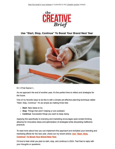
Your logo is more than just a little image that sits at the top of your website. It’s a visual symbol that represents your entire brand. It triggers memories within the minds of your customers related to every experience (good and bad) they have had with your products, services, and people. It also represents your reputation (again, good and bad) with prospective buyers. With images being processed 60,000 times faster than text, this symbol will be used to make a judgment of trustworthiness quicker than you realize.
There’s only one thing worse than a cheap logo, and that’s a cheap looking logo.
Many of the principles of graphic design are closely tied to the science of behavioral psychology. So while your average consumer can’t communicate why your logo makes them feel embarrassed, disgusted, or confused, they’re still going to have that reaction anyway. Even if you can’t articulate it, you probably know what you like (and dislike) when it comes to logos and graphics. Whether you’re considering rebranding or just hiring someone to design your first company or product logo, here are some ways to evaluate how to spot a cheap, or cheap-looking, logo design.
1. A Cheap Logo Is Overly Complex
Just for one second, consider some of the world’s most recognizable logos. Did you just think of the McDonald’s arches? The Nike swoosh? Or the Apple with a bite taken? All of these logos are really simple. Many famous logos are even revised to become even simpler. As HubSpot’s Meg Hoppe highlights, “no one has time to spend dissecting a visually complex logo.” What exactly spells out the difference between complexity and simplicity in logo design? A confusing logo can be caused by the use of too many colors, detailed images, intricate fonts, or excessive superfluous elements. A logo with an extraordinarily complex design doesn’t make your brand look high-class or fancy. It means your graphic designer didn’t understand the value of simplicity.
2. A Cheap Logo Lacks Versatility
One of the most tragic and familiar hallmarks of truly cheap logo design is a lack of versatility. In today’s marketing culture, the ability for a logo to scale and appear attractive across multiple mediums is crucial. Versatility in logo design means usage on smartphones, tablets and computer screens; print advertising and even billboards. Adaptability is a critical filter to consider when creating a logo design, and far too many small business owners aren’t aware of the right limitations. I recommend asking the following questions before you make a final selection, to avoid the need for total rebranding in the future:
- Can this logo be printed in a single color, or just black and white?
- Is this logo’s message retained if it’s shrunk down to no more than 3/4 of an inch in either direction?
- Would the logo look too bland or boring if it were blown up to the size of a billboard?
It would amaze you how many design concepts have to be discarded when you apply the filter of flexibility. Exceptional logo design is usually complex enough to engage on a gigantic scale, and sufficiently simple to tell a story when it’s quite small.
3. A Cheap Logo Is Derivative
There are major trends in the fields of graphic design and branding, fueled primarily by consumer demand. All it takes is a visit to the facetious hipster logo generator to recognize a significant, recent pattern in how “cool” companies are branding themselves. Should you ignore the latest graphic design trends, or avoid incorporating fleeting factors like Pantone’s color of the year into your branding? Almost certainly. The world’s most beautiful and effective logos are almost timeless in their design. If your mission is to communicate your brand’s hipness factor, there are more efficient ways to do this than derivative design. Take the example below of the BMW logo. Their original logo designed in 1916 hasn’t changed too much, only being occasionally refreshed stylistically to keep things fresh. ![]()
4. A Cheap Logo Is Forgettable
The best logo designs in the world communicate an entire brand in one single glance. Lego’s logo (pictured below) works well because it relays the idea of fun and childlike playfulness and is highly memorable. ![]() Mercedes Benz’s branding spells out luxury in nothing more than three lines and a circle. The greatest logos have a story to tell, which is why they’re generally unique. Legendary logo design expert Paul Rand once stated that the only hard and fast rules for logo design were to be: distinctive, memorable, and clear. While it’s extraordinarily difficult to define memorable design, it’s certain to have a few factors. It’s likely to be slightly surprising, without jarring the viewer. It’s addicting and appealing to look at. Ultimately, it’s going to be both original and familiar enough that it leaves the viewer wishing it was their idea. Your brand has something valid and original to offer the world. If your logo design looks like every other small businesses’ branding, you’re not communicating your unique value proposition.
Mercedes Benz’s branding spells out luxury in nothing more than three lines and a circle. The greatest logos have a story to tell, which is why they’re generally unique. Legendary logo design expert Paul Rand once stated that the only hard and fast rules for logo design were to be: distinctive, memorable, and clear. While it’s extraordinarily difficult to define memorable design, it’s certain to have a few factors. It’s likely to be slightly surprising, without jarring the viewer. It’s addicting and appealing to look at. Ultimately, it’s going to be both original and familiar enough that it leaves the viewer wishing it was their idea. Your brand has something valid and original to offer the world. If your logo design looks like every other small businesses’ branding, you’re not communicating your unique value proposition.
5. A Cheap Logo Is the “Wrong” Color
Colors can be misrepresentative or even “wrong”, even if they’re not “ugly” in their own right. Professional logo design always considers color theory, which is the science of how humans perceive various shades. ![]()
- Red: Importance, danger, anger, and passion
- Orange: Energy, health, and vitality
- Yellow: Energy, hope, and cowardice
- Green: Abundance, growth, money, and new beginnings
- Blue: Responsibility, calmness, sadness
- Purple: Creativity, imagination, and royalty
- Black: Power, elegance, mystery, and formality
- White: Purity and cleanliness
Your logo’s primary and secondary colors should reflect who you are as an organization. A financial planning firm, for example, could come across as irresponsible with a yellow logo, while a decadent purple shade may not fit a health food brand. Inappropriate color selections can be a hallmark of low-cost logo design by inexperienced designers on sites like Fivver or 99Designs.
6. A Cheap Logo Is Brand-Inappropriate
While color theory is one of the most important ways logo designs tell stories, it’s far from the only factor. Many experts believe there are approximately six principles of graphic design that affect how a design is perceived by a consumer. These principles are: Balance, Proximity, Alignment, Repetition, Contrast, and Space. All of the fundamental principles of graphic design work together, with the help of color and typography, to communicate a message. If one factor is significantly off or ignored, your message will be obscured by poor design. And more likely than not, the result will be upsetting, confusing, or just plain cheap-looking. A poorly designed logo with insufficient contrast can be difficult for individuals with visual disorders to navigate. An imbalanced logo design upsets the natural human attraction to patterns. Proximity and alignment work to direct the viewers’ eyes appropriately.
Logo design that meets all of the six design principles isn’t a luxury, it’s a necessity for anyone trying to tell a story.
Rebranding is difficult. It’s challenging, expensive, and doesn’t always work. Even on massive budgets, there are some very high-profile cases of logo fails and rebranding disasters. Gap’s short-lived revised logo (below, center) only lasted for four days before they reverted back to the original design. ![]() When purchasing a logo, your goal should never be to settle for the most affordable logo design you can get or to select something that’s going to need to be quickly replaced. Knowing the reasons why some logo design just looks inferior is a critical tool for marketing success.
When purchasing a logo, your goal should never be to settle for the most affordable logo design you can get or to select something that’s going to need to be quickly replaced. Knowing the reasons why some logo design just looks inferior is a critical tool for marketing success.