10 Logo Design Tips for Clients
A good logo is a significant contributor to making that crucial first impression on a customer. Logos convey your company’s values, tell a story, and even help people trust your brand. Your company is at an immediate disadvantage if your logo does not convey the right message to a prospective customer. It could even mean the difference between selecting the competition over you.
Here are ten key elements that are essential to every good logo, regardless of industry or application. When reviewing your current logo or getting started with a new business, make sure your logo has these ten elements:
1. Strong/Balanced

A logo is an icon, whether it’s made up of text alone, a graphic symbol, or both of those elements. And that icon should be visually balanced to create maximum impact on your viewer.
Favor logos that have a strong, balanced look.
2. Simple

Simplicity is vital. A complex logo will be difficult to print and reproduce. Even worse, complex logos can be harder for casual viewers to recognize and identify quickly.
Take a moment and think about the most famous brands you know. Most likely, you’ve thought of companies like Apple, Volkswagen, Target, McDonald’s, etc. What do they all have in common? They all have simple and easily recognized logos when printed in color, grayscale, or black and white.
3. Memorable
Your logo does not always need to describe what your business does literally. Have you ever seen a car manufacturer with a picture of a car as their logo? How about a shoe manufacturer? It would look silly to have a picture of a shoe… on a shoe. Besides, such literal interpretations are not going to be memorable for a viewer.
When considering logo designs, choose a logo that communicates the essence of your brand without even needing the business name. (examples: Swoosh for Nike). For this to succeed, the logo must be unique, and it must be informed by a deep understanding of your brand.
It also helps to walk the line between designs that are obvious and abstract. Logos that are too obvious are most likely already used by many other companies – and, as such, will not be memorable. However, too much abstraction can be dangerous because your message can be lost. So, aim for a logo that cleverly uses visual elements to embody your business’s brand.
Viewers are more likely to remember your logo if it’s unique and it makes them think (just not too hard).
4. Flexible

A logo should be visible and easily identifiable on a big billboard from 100 meters away or on a small business card from to 20 millimeters away. So make sure your logo can scale in size.
Consider how your logo will be used. If your logo will regularly appear embroidered on uniform shirts, aim for a relatively simple design that won’t lose its impact in that medium. If it will only appear in print or online, you can get away with a slightly more complex design due to the sharpness print and online use provides.
Make sure your new logo design works well in full color as well as in black and white. This will ensure that it shows up well on any background – light, dark, or multicolored.
It’s vital that you be able to use your logo consistently on all marketing materials. So, make sure your logo is flexible enough to accommodate all marketing materials.
5. Appropriate Colors

When choosing colors for your logo, bear in mind two important factors – brand appropriateness and cost.
Appropriateness
Different colors communicate different emotional ideas. Make sure that your logo colors convey appropriate messages about your brand. Do the colors reinforce and strengthen your brand identity? (For example, blue often communicates trust, loyalty, and freshness. The color blue is common in banking and finance. Green commonly represents life, nature, and purity.) If not, then you should consider a different color choice.
Cost
When printing a logo, costs increase as more colors are involved. So, think twice about including more than three colors in your logo – or ask your designer for a version featuring fewer colors as well as black and white versions. You can use your most colorful variation of the logo on the web and save the restricted color version for print use. But remember that consistency is key. It’s best if you can use the same logo on all media.
A Note on Color Gradients:
Although gradients provide an aesthetically pleasing effect on computers, they are harder to reproduce effectively offline. For a primarily web-based business, gradients are okay. But, if you plan to use your logo on many physical mediums, a color gradient logo may not be the best option for you.
6. Timeless
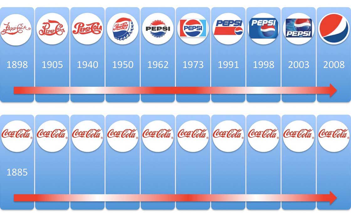
A logo should have a long life expectancy. It may evolve and change over time, but those changes should be minimal at best. A consistent brand identity helps to build strong customer relationships. For this reason, the best logos change very little yet feel fresh and vibrant every time you see them.
So, how do you ensure that your logo will serve your business well for a long time? Avoid trendy logo design fads. They’re likely to anchor your logo in a specific time period and feel outdated quickly. Instead, make choices that are informed by your brand identity, which should remain consistent even as your business grows.
7. Unique
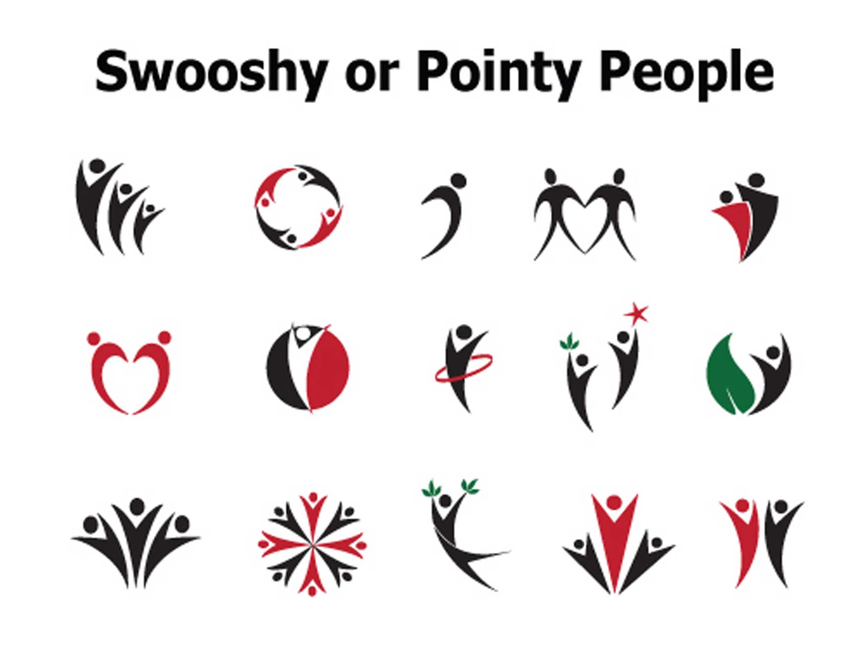
A good logo stands out from the crowd. In order to do this, it must be unique.
This is yet another reason to avoid design fads or overused concepts like these. With thousands upon thousands of fonts, billions of color combinations, and an infinite flow of possible design ideas, there’s no excuse to choose a common logo.
Try to avoid common logo cliches like “swooshy people,” “wooshes,” and “pinwheels.” Also, familiarize yourself with the logo cliches in your industry – and then carefully avoid them. A boilerplate logo is the quickest way to look low-budget and worth ignoring.
8. Quality Typography
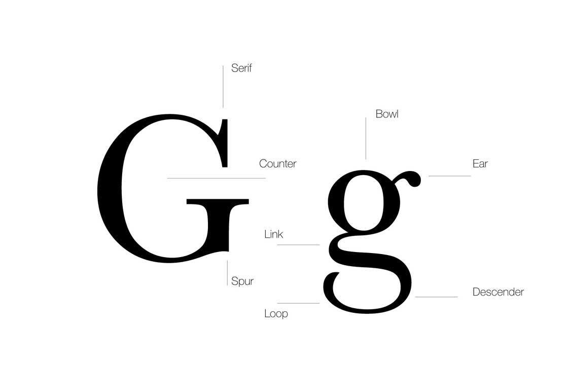
Don’t forget the font! The typography you choose for your logo must communicate on two levels – it should be easily legible, and it must visually reflect your brand identity.
Avoid any fonts that are too difficult to read. Can it be read at small sizes? Is the letterspacing/word spacing well adjusted?
From the options remaining, prioritize the fonts that visually represent your brand. Ask yourself what you’re trying to communicate. Is your brand playful or dignified? Modern or old-fashioned? Choose a font that visually communicates the traits that are most relevant to your brand.
Serif typefaces (as pictured above) convey a sense of dignity, old-world reliability, and elegance. They’re also easier to read in print. Sans serif fonts are often more clean-looking and easier to read on a screen. They can be very versatile – communicating stability, power, or whimsy, depending on the execution.
9. Branding
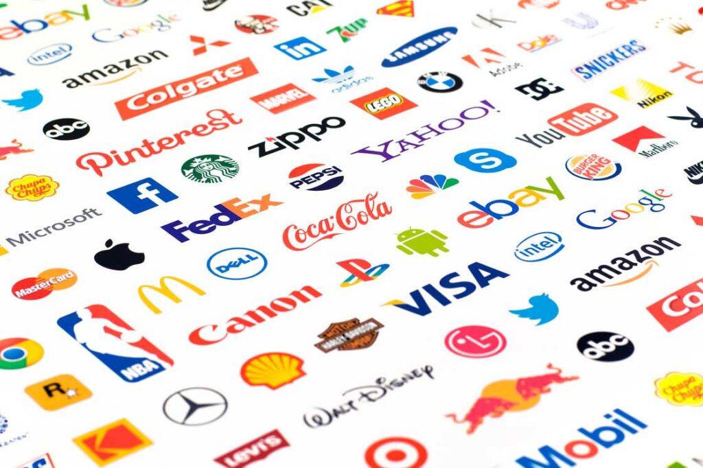
“Design is the silent ambassador of your brand.” – Paul Rand
Your logo has to derive meaning from your brand, not the other way around. The world’s best brands are not well-known because of their logo, they are known because of the people and vision that the logo represents. When deciding on the direction of your logo, make sure that you have already thought about your brand and the direction of your company. Keep your audience and products/services in mind as you plan your logo. This guide on building your brand identity from the ground up is a good start.
10. Vector is Best
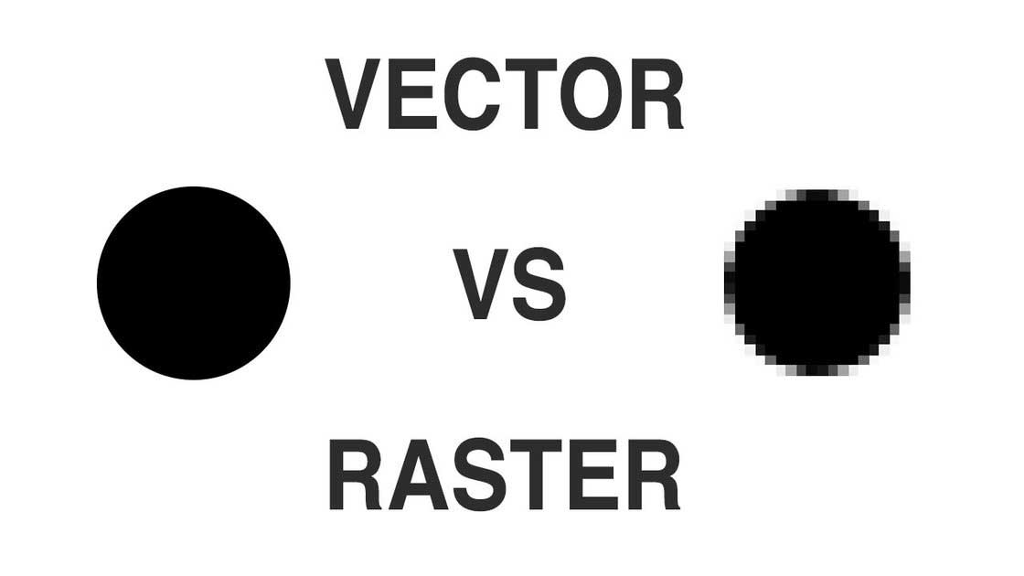
Always request vector-based graphics with your final files. Vector images retain their quality as they increase or decrease in size, while raster images will pixelate if they are resized.
While your final files should always include JPG and PNG files for ease of use, you should also receive vector EPS and/or AI files. Vector files will provide you with the ultimate flexibility.
Strong, consistent branding provides the opportunity for small businesses to stand out from the competition.
With the right logo, you can communicate your brand’s values from the first moment a customer sees it. You only get one chance for a first impression, so make it a good one.


