Trans City Property Management
Modernizing a Dated Logo and Marketing
Scope of Work: Brand Identity. Logo Design. Graphic Standards Guide.
TransCity Property Management, a residential rental property management company based in the Phoenix Valley, wanted a new logo because its original design was dated.
Instead of designing a completely new brand identity, we decided that an updated design with a more modern look would better suit their goals. Specifically, we revised the mark with a more geometric and symmetrical design.
The updated design also hints at the income potential of rental properties with upward-pointing arrows. To complement the updated houses mark, we set the company’s name in a modern geometric sans-serif typeface.
Overall, we’re pleased with the refreshed logo design and believe it successfully captures the essence of TransCity Property Management’s modern business.
Office Door Signage
Primary Logo
Alternate Logo
App & Social Icons, Mono Marks
Logo Before and After
Business Cards
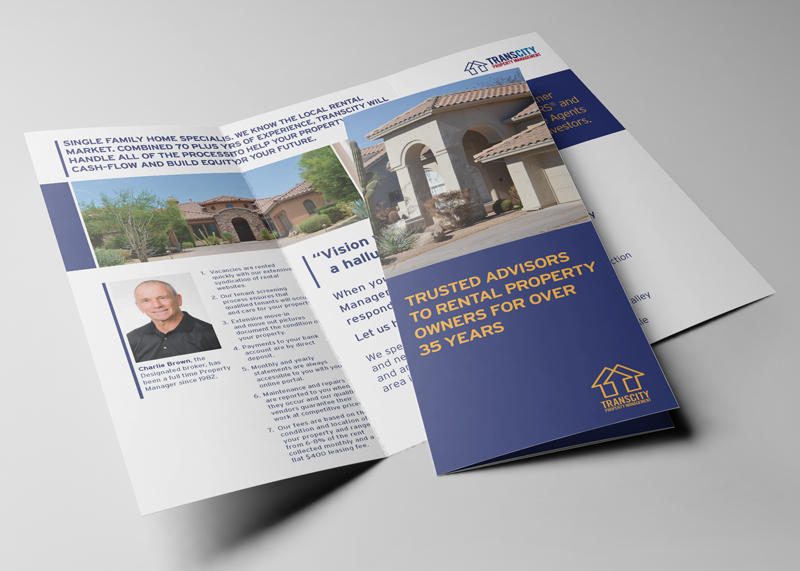
Printed Tr-Fold Brochure
Graphic Standards Guide

Other Case Studies You Might Be Interested In
Critical Path Imaging
Critical Path Imaging gets a unique new identity program.

Knox Promos
Brand launch for Knox Promos, a new corporate promotional products offshoot of an established screen-printer.

Queen Creek Chamber Of Commerce
New visual identity program creates consistency across all Queen Creek Chamber of Commerce communications, events, and programs.

Community Choice Pediatrics
From confusion to clarity: Unifying multiple pediatric practices into a single brand

COPA Health
Merging for a Greater Cause: The Challenge of Creating a New Brand Name.

Cyclone Shipping
Reinventing a brand and re-energizing its founder.